Your cart is currently empty!
Oil painting isn’t just a decoration—it’s a statement. When chosen thoughtfully, a painting can tie a whole room together and instantly boost the atmosphere of your living space. But here’s the tricky part: how do you make sure your oil painting fits in with your furniture style?
Whether you’re going for minimalist vibes, cozy Nordic feels, wabi-sabi calmness, or vintage charm, this guide will help you choose and match oil painting colors that don’t just work—they wow.
🎨 The Basics of Color Matching in Interior Design
Before we jump into specific styles, let’s talk about color harmony.
Here are a few key principles to follow:
- Complementary colors: Colors opposite on the color wheel (like blue and orange) create bold contrast.
- Analogous colors: Colors next to each other (like green and blue) are soothing and calm.
- Neutral bases: White, beige, grey, or muted tones work well as a backdrop for oil paintings.
Matching oil painting color schemes to furniture is all about creating balance. If your room is already colorful, pick paintings with muted tones. If your furniture is plain or neutral, let your painting be the color star.
🪑 Minimalist Style: Less Is More
Minimalism is all about simplicity, clean lines, and a calm atmosphere. Furniture usually sticks to neutral tones like white, gray, or black. So, how do you pick an oil painting?
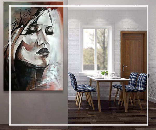
Color tip: Choose soft tones or monochrome abstract oil paintings. Black and white textured pieces or those with subtle gradients blend beautifully into minimalist settings.
Painting style: Try abstract or textured oil paintings with minimal color blocking. Think of soft brushwork with just a splash of contrast.
🏯 Wabi-Sabi: Beauty in Imperfection
The wabi-sabi aesthetic embraces raw textures, natural tones, and organic materials. It celebrates imperfection and calmness.
Color tip: Earthy colors like clay, sand, moss green, or weathered grey. Avoid anything too glossy or overly vibrant.
Painting style: Choose wabi-sabi oil paintings that highlight natural textures or layered neutrals. Textured oil paintings work great here too. Bonus points if it looks like it was aged by nature.
❄️ Scandinavian Style (Nordic): Cozy + Functional
Nordic or Scandinavian interiors love light spaces, pale wood, and cozy elements. The color palette usually sticks to whites, light grays, and soft pastels.
Color tip: Add warmth with muted yellows, soft blues, or warm greys. Abstract forms or loose florals work wonderfully.
Painting style: Opt for abstract oil painting or light-toned textured works. The goal is to complement the natural light and airy feel of the room, not weigh it down.
🧡 Vintage & Retro Vibes
Vintage rooms often feature richer tones like mustard yellow, olive green, burgundy, and dark wood. The furniture might feel nostalgic or come with bold patterns.
Color tip: Go bold or go home. Deep blues, rusty oranges, and dark greens can add even more personality.
Painting style: Retro-style oil paintings or vintage abstract pieces. Even some modern textured art can work when the color palette is right.
🖼️ How Oil Paintings Elevate Space Atmosphere
One of the coolest things about oil paintings is their ability to define the tone of a space.
- In minimal interiors, they add life.
- In retro spaces, they push the drama.
- In calm wabi-sabi rooms, they echo the story of nature and time.
Oil paintings don’t just sit there. They speak—they tell a story that interacts with everything around them. The right painting can make a space feel more curated, more finished, more… you.
🖌️ Painting Types That Mix Well With Any Style
If you’re not sure where to start, here are a few versatile oil painting types that blend into many interiors:
- Abstract Oil Painting – Flexible in both form and color, easy to match with any furniture tone.
- Textured Oil Painting – Adds dimension to flat interiors, perfect for minimalist or wabi-sabi styles.
- Wabi-Sabi Inspired Oil Art – Ideal for creating serenity and depth in soft-toned interiors.
Final Thoughts
Matching oil paintings with your furniture style isn’t rocket science, but it does take a little attention to tone and feeling. Just ask yourself: Does this painting belong here emotionally and visually? If the answer is yes, you’re on the right path.
And hey, don’t be afraid to mix things up. A bit of contrast can bring life to a room, and sometimes, opposites attract—in art and in home decor.
Explore our curated collections at OKarty.com and discover your next perfect match.